An accessible custom dropdown menu in Vue.js

Designers and developers often want to bring a dropdown menu in line with a website’s design. To achieve that they either add styling to <select> elements where possible or result to using other HTML elements that partially mimic the <select> behaviour. None of these approaches are ideal, because they have either styling or accessibility limitations.
In this article I explore a third approach which is using the ARIA (Accessible Rich Internet Applications) attribute role="listbox" to create a custom accessible dropdown menu. This role can be added to any HTML element which we can easily customise to match our styling needs while making the dropdown menus fully accessible.
My implementation is based on the W3C Collapsible Dropdown Listbox Example but using Vue.js. The component works like any other Vue.js form component because it implements the v-model directive (read more here). You can access the full demo here.
Aria role “listbox”
Before delving into code, it’s essential to understand the ARIA role “listbox” and how we can use it to implement a custom dropdown menu. This role indicates a list of options from which a user can select one or more of them.
Screen readers are able to read HTML elements with role="listbox" along with their labels and their options (role="option"). As a result, listboxes are screen reader friendly in a similar fashion to to native <select> elements.
The HTML
Starting with the HTML for our accessible custom dropdown, the key attributes that we need to include are:
- A label for the listbox (referenced with
aria-labelledby) - A listbox element (with
role="listbox") - A set of options nested inside the listbox (with
role="option")
The markup that I will use for my implementation is:
<div class="listbox">
  <span class="listbox__label" id="listbox-label">Choose an element:</span>
  <div class="listbox__dropdown">
    <button aria-haspopup="listbox" aria-labelledby="listbox-label listbox-button" id="listbox-button">
      Option 1
    </button>
    <ul id="listbox-list" tabindex="-1" role="listbox" aria-labelledby="listbox-button" style="display: none;">
      <li id="option-1" role="option" aria-selected="true">Option 1</li>
      <li id="option-2" role="option">Option 2</li>
      <li id="option-3" role="option">Option 3</li>
    </ul>
  </div>
</div>
In this example, I use a concatenated label for our dropdown menu which reads “Choose an element [selected option]” and where [selected option] is the option with the attribute aria-selected="true". I also use a button with the attribute aria-haspopup="listbox" to indicate that the button will change the visibility of the element with role="listbox".
The interactivity
The ARIA labels in the example HTML above make the listbox more accessible for screen readers. However, I still need to add interactivity for it to be able to mimic the browser’s native <select> dropdown behaviour.
The interactivity that I need to add boils down to the following functionality:
- A click handler for the button (
id="listbox-button") to toggle the visibility of the options list withrole="listbox". - A keydown handler for the same button to show the list of options when the up or down arrow keys are pressed.
- A click handler for the list of options (
role="listbox) to select an option when one is clicked. - A keydown handler for the same list to interpret the keyboard navigation and select the appropriate option.
Additionally to the above, I will add another handler that checks whether the user clicked outside the listbox in order to hide the list of options when they do.
Let’s see now how the HTML and the interactivity above come together in a Vue.js component in the next section.
A Vue.js listbox component
In this section I break down my custom Vue.js Listbox component in the three parts it consists of: the template (<template>), the functionality (<scripts>) and the styling (<style>). I explain each part in detail to allow you to modify it if needed to suit your project’s needs. For my component I’m using Vue.js 2, babel and SCSS.
The template
Starting with the template for my custom component, I’ve translated the HTML described in The HTML section in Vue.js code, adding dynamic attributes and event handlers where needed.
<template>
  <div class="listbox" :value="value" ref="listbox">
    <span
      :id="`${name}-label`"
      :class="{ 'listbox__label--visually-hidden': !showLabel }"
      class="listbox__label"
    >
      {{ label }}
    </span>
    <div class="listbox__dropdown" v-click-outside="hideListbox">
      <button
        :id="`${name}-button-label`"
        :aria-labelledby="`${name}-label ${name}-button-label`"
        type="button"
        aria-haspopup="listbox"
        class="listbox__button"
        @click="toggleListbox"
        @keydown="checkShow"
        ref="listboxButton"
      >
        {{ value ? selectedOptionLabel : emptyOptionLabel }}
      </button>
      <ul
        v-show="!listboxHidden"
        :aria-labelledby="`${name}-label`"
        :aria-activedescendant="value"
        tabindex="-1"
        role="listbox"
        class="listbox__list"
        @keydown="checkKeyDown"
        @click="checkClickItem"
        ref="listboxNode"
      >
        <li
          v-for="(option, index) in options"
          :key="`${name}-option-${index}`"
          :aria-selected="option.value === value"
          :data-value="option.value"
          class="listbox__option"
          role="option"
          ref="listboxOptions"
        >
          {{ option.label }}
        </li>
      </ul>
    </div>
  </div>
</template>
This template reflects the listbox HTML with the added interactive features:
- a value bound to the component’s value property (line 2) that is required when using v-model on custom components (read more here).
- a click outside handler (
v-click-outside) namedhideListbox(line 10) that checks whether the user clicked outside the listbox and hides the dropdown if so. - a click handler named
toggleListboxfor the button (line 17) that toggles the visibility of the list of options. - a
keyDownhandler namedcheckShowfor the button (line 18) that shows the list of options when the up or down arrow keys are pressed - a
keyDownhandler namedcheckKeyDownfor the list of options (line 30) that interprets keyboard navigation and selects the appropriate option. - a click handler named
checkClickItemfor the listbox (line 31) that selects an option when it’s clicked.
As well as the added interactivity the template includes ref attributes for the listbox (line 2), the listbox button (line 19), the listbox list (line 32) and each listbox option (line 41). The ref attribute allows us to assign a reference ID to a child element, which we can quickly access inside our component as this.$refs['reference-ID']. This feature is very handy in this case to manually trigger events (e.g. focus) and update attributes for a specific element without needing additional component data/props.
Additionally, I conditionally print the class .listbox__label--visually-hidden for the listbox label (line 5). This label goes above the dropdown menu and will only be shown to non screen readers if showLabel is equal to true.
Lastly, on line 21 I’m using an emptyOptionLabel property to provide a default label when no option in the listbox is selected (e.g. “Choose a value”). This can be handy when you don’t want your dropdown menu to have a preselected option.
The functionality
Probably the most complicated part of this component is its functionality. In order to digest its inner workings more easily, I’ve broken it down in three parts: the variables, the methods and the additional functionality.
Component variables
Starting with the component variables, we’ll take a further look into the data attributes, the properties and the computed properties that make up the Listbox component.
Data attributes
The data attributes that I used in this component are:
keyClear– saves a timeout for which we listen for character keyboard events.keysSoFar– stores the characters typed by the user in the defined timeout (keyClear).listboxHidden– marks whether the list of options is hidden or not (true/false).searchIndex– stores the index of the selected option. I use this index when searching for the next match in the list of options after a user has typed a set of characters.
In practice these data attributes are defined as follows:
data: () => ({
  keyClear: null,
  keysSoFar: '',
  listboxHidden: true,
  searchIndex: null,
}),
Properties
The properties for this component are:
value– the selected listbox option. It’s a required property when using v-model on custom components (read more here).label– a label to show above the listbox that can be visually hidden for non screen readers.options– an array of options (objects) for the listbox. Each listbox option needs to have the following format:{ value: "option-1", label: "Option 1" }name– a unique string to identify this dropdown from other ones used on the same page.emptyOptionLabel– the text to show when there’s no preselected option in the listbox.showLabel– whether to show the label above the listbox.
In practice these properties are defined as follows:
props: {
value: {
type: String,
},
label: {
type: String,
required: true,
},
options: {
type: Array,
required: true,
},
name: {
type: String,
required: true,
},
emptyOptionLabel: {
type: String,
default: "Choose a value",
},
showLabel: {
type: Boolean,
default: false,
},
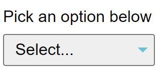
},Based on the above properties, here is an example use of this custom dropdown:
<listbox
  :options="options"
  :show-label="true"
  v-model="listboxValue"
  name="options"
  label="Pick an option below"
  empty-option-label="Select... "
/>
Notice how I bind the ListBox value (v-model) with the data property listboxValue of the parent component. The parent component’s listboxValue data attribute will now update with every Listbox value change.
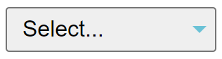
Here is the output of the example use above:
Computed properties
The only computed property used in this component is the selectedOptionLabel which returns the label of the selected option. This property is calculated as follows:
computed: {
  selectedOptionLabel() {
    const selectedOption = this.options.find(option => option.value === this.value);
    return selectedOption && selectedOption.label;
  },
},
Component methods
Continuing with the methods for this component, in this section I explain each one as it appears in the Vue.js template alongside any other methods called within it. I will skip the handler for the custom directive v-click-outside as I will expand on this one further in a later section.
toggleListBox
The first method in the template is attached to the click handler for the listbox button (.listbox__button). This method toggles the visibility of the list of options (.listbox__list) when a user clicks on it.
In practice this method calls the methods showListbox or hideListbox based on whether the listbox list is hidden or visible as shown below.
// Toggles Listbox based on this.listboxHidden
toggleListbox() {
  this.listboxHidden ? this.showListbox() : this.hideListbox();
},
// Shows the ListBox list and puts its on focus
showListbox() {
  this.listboxHidden = false;
  this.$refs.listboxButton.setAttribute("aria-expanded", "true");
  this.$refs.listboxNode.focus();
},
// Hides the ListBox list
hideListbox() {
  this.listboxHidden = true;
  this.$refs.listboxButton.removeAttribute("aria-expanded");
},
Notice how I update the attribute “aria-expanded” for the listbox list depending on whether the list is shown (aria-expanded="true") or hidden (removing aria-expanded attribute). This change notifies screen readers about the dropdown state (expanded/collapsed).
checkShow
The next event handler in the template is checkShow for the listbox button keyDown event. This is a simple method that listens for the up and down keyboard events in order to show the listbox options. The code for checkShow is as follows:
/**
 * Keypress handler for the listbox button.
 * It shows the listbox list on up/down key press.
 */
checkShow(event) {
  const key = event.which || event.keyCode;

  switch (key) {
    case keyCodes.UP:
    case keyCodes.DOWN:
      event.preventDefault();
      this.showListbox();
      this.checkKeyDown(event);
      break;
    default:
      break;
  }
},
checkKeyDown
This method is responsible for interpreting keyboard events inside the list of options. It’s called in checkShow and it’s also the keyDown handler for the listbox list (.listbox__list). Let’s take a look at the code and go through what it does step by step.
/**
 * Handles various keyboard controls; UP/DOWN/HOME/END/PAGE_UP/PAGE_DOWN
 *
 * @param {Event} event The keydown event object
 */
checkKeyDown(event) {
  const key = event.which || event.keyCode;

  switch (key) {
    case keyCodes.UP:
    case keyCodes.DOWN:
      event.preventDefault();
      const selectedItemIndex = this.options.findIndex(option => option.value === this.value);
      let nextItem = selectedItemIndex ? this.$refs.listboxOptions[selectedItemIndex]: this.$refs.listboxOptions[0];

      if (key === keyCodes.UP) {
        // If there's an option above the selected one
        if (selectedItemIndex - 1 >= 0) {
          // Assign the previous option to nextItem
          nextItem = this.$refs.listboxOptions[selectedItemIndex - 1];
        }
      } else {
        // If there's an option below the selected one
        if (selectedItemIndex + 1 <= this.options.length) {
          nextItem = this.$refs.listboxOptions[selectedItemIndex + 1];
        }
      }

      if (nextItem) {
        this.focusItem(nextItem);
      }

      break;
    case keyCodes.HOME:
    case keyCodes.PAGE_UP:
      event.preventDefault();
      this.focusFirstItem();
      break;
    case keyCodes.END:
    case keyCodes.PAGE_DOWN:
      event.preventDefault();
      this.focusLastItem();
      break;
    case keyCodes.RETURN:
    case keyCodes.ESC:
      event.preventDefault();
      this.hideListbox();
      this.$refs.listboxButton.focus();
      break;
    default: {
      // If the user typed a set of characters,
      // focus the option that matches those characters
      const itemToFocus = this.findItemToFocus(key);
      if (itemToFocus) {
        this.focusItem(itemToFocus);
      }
      break;
    }
  }
},
Firstly, I read the key that triggered the keyDown event (event.which || event.keyCode). I then use the key to trigger the appropriate action using a switch/case statement. The switch cases and their corresponding actions are as follows:
- The up or down key was pressed: I prevent the default browser behaviour (line 12) and I find & set a default option to select next (lines 13-14). If the up arrow was pressed, I set the option to select next to be the one before the selected one (lines 16-21). On the contrary, when the down arrow is pressed, I set the option to select next to be the one after the selected one if any (lines 22-27). If after all these checks there is an option to select, I call the method
focusItemfor that option (lines 29-31). - The home or page up key was pressed: I prevent the default browser behaviour and select the first option in the list of options by calling the method
focusFirstItem(lines 35-39). - The end or page down key was pressed: I prevent the default browser behaviour and select the last option in the list of options by calling the method
focusLastItem(lines 40-44). - The enter or the escape key was pressed: I prevent the default browser behaviour and hide the listbox list (lines 45-48). I also set the focus to the listbox button (line 49).
- Default: I search through the options and select one if the keys pressed are partially matching the option’s label (lines 51-59)
Almost every case described above corresponds to a new selection in the list of options. In order to select an option I use four different methods; focusFirstItem, focusLastItem and focusItem which I explain in detail below.
focusFirstItem
This function is called inside checkKeyDown and it selects the first option in the list of options. In practice it looks like this:
/**
 *  Focus on the first option
 */
focusFirstItem() {
  this.focusItem(this.$refs.listboxOptions[0]);
},
I use the method focusItem to select an option, which I’ll go through in detail in a later section. Notice how I call focusItem for the first option in the array of options since I know that the options array is a required property and cannot be undefined.
focusLastItem
Conversely to focusFirstItem, this method selects the last option in the list of options as shown below.
/**
 *  Focus on the last option
 */
focusLastItem() {
  const lastListboxOption = this.$refs.listboxOptions[this.options.length - 1];
  this.focusItem(lastListboxOption);
},
focusItem
As previously mentioned focusItem is the method I call to select an option from the list of options. The code for this method is as follows:
/**
 * Select the option passed as the parameter.
 *
 * @param {Element} element - the option to select
 */
focusItem(element) {
  // Defocus active element
  if (this.value) {
    const index = this.options.findIndex(option => option.value === this.value);
    const listboxOption = this.$refs.listboxOptions[index];
    this.defocusItem(listboxOption);
  }
  element.setAttribute("aria-selected", "true");
  this.$refs.listboxNode.setAttribute(
    "aria-activedescendant",
    element.getAttribute('data-value')
  );
  // Trigger the v-model "input" event with value equal to element.id
  this.$emit("input", element.getAttribute('data-value'));

  // Scroll up/down to show the listbox within the viewport
  if (this.$refs.listboxNode.scrollHeight > this.$refs.listboxNode.clientHeight) {
    const scrollBottom = this.$refs.listboxNode.clientHeight + this.$refs.listboxNode.scrollTop;
    const elementBottom = element.offsetTop + element.offsetHeight;

    if (elementBottom > scrollBottom) {
      this.$refs.listboxNode.scrollTop = elementBottom - this.$refs.listboxNode.clientHeight;
    } else if (element.offsetTop < this.$refs.listboxNode.scrollTop) {
      this.$refs.listboxNode.scrollTop = element.offsetTop;
    }
  }
},
Firstly, I check whether an option is already selected in our dropdown and remove the focus from it (lines 7-12). I then update the aria attributes for the new selected option and the options list and trigger an input event for our v-model component (lines 13-19). Triggering the input event will notify the parent component for the value change.
Finally, I check whether the options list is visible within the browser’s viewport and scroll the page if not to reveal the list (lines 21-31).
defocusItem
This method removes the aria-selected attribute for the HTML element passed as the parameter.
/**
 * defocus on the element passed as a parameter.
 *
 * @param {Element} element
 */
defocusItem(element) {
  if (!element) {
    return;
  }
  element.removeAttribute("aria-selected");
},
findItemToFocus
This method is called when a user types a set of characters inside the list of options. It searches for an option label that contains the set of characters and if it finds a match, it selects that option.
/**
  * Returns an option that its label matches the key or
  * null if none of the match the key entered.
  *
  * @param {String} key typed characters to check whether they match an option
  */
findItemToFocus(key) {
  const character = String.fromCharCode(key);

  // If it's the first time the user is typing to find an option
  // set the search index to the active option
  if (!this.keysSoFar) {
    this.searchIndex = this.options.findIndex(option => option.value === this.value);
  }

  this.keysSoFar += character;
  this.clearKeysSoFarAfterDelay();

  // Find the next matching element starting from the search index
  // until the end of all the options
  let nextMatch = this.findMatchInOptions(
    this.searchIndex + 1,
    this.options.length
  );

  // If there wasn't a match search for a match from the start of
  // all the options until the search index
  if (!nextMatch) {
    nextMatch = this.findMatchInOptions(0, this.searchIndex);
  }

  return nextMatch;
},
Let’s go through what this method does step by step:
- It reads the key typed by the user as a String character (line 8).
- If it’s the first time the user typed a character inside the options list, it sets the
searchIndexdata attribute as the index of the selected option (lines 10-14). - It adds the String character to the data attribute
keysSoFar(line 16) which contains the characters typed in the timeout we’ve set (keyClear). - Then it resets the timeout for which we listen for character keyboard events (line 17).
- It looks for an option that matches the typed characters starting from the index –
searchIndexthat we’ve set earlier (lines 19-24). - If it hasn’t found a match in the previous step, it looks for matches in the list before the set index –
searchIndex(lines 26-30). - Finally it returns any match it has found or null if it hasn’t found any (line 32).
clearKeysSoFarAfterDelay
Once the user types a String character in the list of options I set a timeout of 500 milliseconds to wait in case the user types another character. The more characters the user types the more accurate the match in the list of options will be.
When the user types more than one character, I reset the timeout to keep listening for more characters. When the time is up, I clear the timeout and the keys typed so far.
// Resets the keysSoFar after 500ms
clearKeysSoFarAfterDelay() {
  if (this.keyClear) {
    clearTimeout(this.keyClear);
    this.keyClear = null;
  }
  this.keyClear = setTimeout(() => {
    this.keysSoFar = "";
    this.keyClear = null;
  }, 500);
},
findMatchInOptions
This method looks for an option that starts with the characters typed by the user. If a match is found, it returns the option element or otherwise it returns null.
/**
 * Returns an element that its label starts with keysSoFar
 * or null if none is found in the options.
 *
 * @param {String} keysSoFar
 */
findMatchInOptions(startIndex, endIndex) {
  for (let i = startIndex; i < endIndex; i++) {
    if (
      this.options[i].label &&
      this.options[i].label
        .toUpperCase()
        .indexOf(this.keysSoFar) === 0
    ) {
      return this.$refs.listboxOptions[i];
    }
  }
  return null;
},
checkClickItem
The last method referenced in the Vue.js template is checkClickItem. This method is a click handler for the list of options. It checks whether the click was triggered for an option and if so, sets the option as the selected one, hides the list of options and sets the focus to the listbox button as shown below:
/**
 * On option click it focuses on the option.
 *
 * @param {Event} event
 */
checkClickItem(event) {
  if (event.target.getAttribute("role") === "option") {
    this.focusItem(event.target);
    this.hideListbox();
    this.$refs.listboxButton.focus();
  }
},
Additional component functionality
In addition to the functionality proposed in W3C’s Listbox implementation, I decided to include a handler that detects whether the user clicked outside the Listbox dropdown and hide the dropdown if so. This interactivity further matches the native <select> dropdown menus that users are accustomed to.
After some research on potential ways to solve this problem, I came across this Stackoverflow answer that proposes to trigger a “click-outside” event using a custom Vue.js directive. This custom directive triggers the custom event ‘click-outside’ whenever an element other than the targeted one is clicked.
In practice this directive is registered like this:
import Vue from 'vue';

Vue.directive('click-outside', {
  bind: function (el, binding, vnode) {
    el.clickOutsideEvent = function (event) {
      // if the click event was triggered for an element outside the target element
      if (!(el === event.target || el.contains(event.target))) {
        // trigger the event handler with event as an argument
        vnode.context[binding.expression](event);
      }
    };
    document.body.addEventListener('click', el.clickOutsideEvent);
  },
  unbind: function (el) {
    document.body.removeEventListener('click', el.clickOutsideEvent);
  },
});
And used with the example handler hideListbox like this:
<div v-click-outside="hideListbox" />The styling
Finally, since we’re using divs, buttons and lists for our markup we need to add some styling to make the listbox look closer to a <select> dropdown menu. For this example the styling is the following:
<style lang="scss">
.listbox {
  font-size: 0;
  font-family: Arial, Helvetica, sans-serif;
}

[role="listbox"] {
  min-height: 18em;
  padding: 0;
  background: white;
  border: 1px solid #aaa;
}

[role="option"] {
  display: block;
  padding: 0 1em 0 1.5em;
  position: relative;
  line-height: 1.8em;
  font-size: 1rem;

  &.focused {
    background: #bde4ff;
  }
}

[role="option"][aria-selected="true"]::before {
  content: "✓";
  position: absolute;
  left: 0.5em;
}

button {
  font-size: 16px;

  &[aria-disabled="true"] {
    opacity: 0.5;
  }
}

.listbox__button {
  font-size: 1rem;
  text-align: left;
  padding: 5px 10px;
  width: 150px;
  position: relative;

  &:after {
    width: 0;
    height: 0;
    border-left: 5px solid transparent;
    border-right: 5px solid transparent;
    border-top: 5px solid #6bc2d6;
    content: " ";
    position: absolute;
    right: 5px;
    top: 50%;
    transform: translateY(-50%);
  }

  &[aria-expanded="true"]::after {
    border-left: 5px solid transparent;
    border-right: 5px solid transparent;
    border-top: 0;
    border-bottom: 5px solid #6bc2d6;
  }
}

.listbox__list {
  border-top: 0;
  max-height: 10rem;
  overflow-y: auto;
  position: absolute;
  margin: 0;
  width: 148px;
}

.listbox__label {
  font-size: 1rem;
  padding-bottom: 0.5rem;
  display: inline-block;
}

.listbox__label--visually-hidden {
  position: absolute;
  height: 1px;
  width: 1px;
  overflow: hidden;
  clip: rect(1px, 1px, 1px, 1px);
  white-space: nowrap;
}
</style>
Which outputs the following dropdown menu: